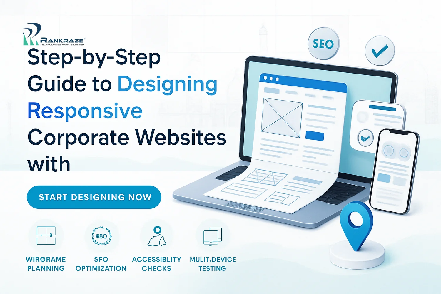
Step-by-Step Guide to Designing Responsive Corporate Websites with SEO and Accessibility Tips
Your website is often the first thing people see about your business. If it does not work well on phones, tablets, or computers, your brand can lose trust quickly. Based on my experience with corporate teams in India, responsive web design is a must, not just a nice-to-have.
Many business owners think responsive design is only about how a site looks on mobile. But it affects user experience, SEO, accessibility, and trust. Ignoring these areas can hurt your search rankings, conversions, and reputation.
This guide gives you a practical, step-by-step system for building responsive corporate websites. These steps are the same ones I use with real Indian businesses. The focus is on:
- Corporate audience research for India’s B2B landscape
- Mobile-first wireframing and prototyping
- Modern layout techniques with CSS Grid and Flexbox
- SEO and accessibility from the start
- Framework, performance, and CMS integration strategies
- Case studies from India and global leaders
Whether you are updating an old site or building a new one, these steps will help you avoid mistakes. You will build a website that helps your business grow.
Detailed Steps for Designing Responsive Corporate Websites
A successful responsive corporate site is not about luck. It starts with understanding your users and ends with a site that works well for everyone. These steps blend design, development, SEO, and accessibility for the best results.
1. Conduct User and Market Research Tailored to Corporate Audiences
Every good project starts with research. Guessing what corporate buyers want is risky. Decision-makers want quick access to trust signals, like certifications and privacy policies.
- Talk to users and get insights from sales and support teams.
- Check competitor websites to find strengths and weaknesses.
- Map user journeys and test the path from homepage to inquiry.
- Track device usage. In India, over 70% of B2B site traffic comes from mobile, according to Statista.
2. Create Mobile-First Wireframes and Prototypes
Mobile-first design is important. Designing for small screens keeps only the most important content and features. This helps your site stay clear and fast.
- Use Figma or Adobe XD for wireframes.
- Keep navigation clear and calls-to-action easy to find.
- Use touch-friendly buttons and readable fonts (at least 16px).
- Test clickable prototypes with real users and devices.
3. Implement Flexible Grid Layouts Using CSS Grid and Flexbox
Fixed-width layouts do not work anymore. Modern sites use CSS Grid and Flexbox for layouts that adjust to any device.
- CSS Grid: Good for complex, multi-directional layouts.
- Flexbox: Best for simple, straight-line layouts like navigation bars.
- Set media breakpoints for different screen sizes and test on real devices.
This gives you layouts that look professional and work everywhere.
4. Ensure Scalable and Optimized Images and Media Assets
Large, unoptimized images slow down websites. On slow networks, this can ruin a user’s first impression.
- Save images in modern formats like WebP or AVIF for smaller file sizes.
- Use srcset and sizes attributes so devices load only what they need.
- Compress videos with Handbrake and use a CDN for delivery.
- Write descriptive alt text for accessibility and SEO.
- Run images through Squoosh or TinyPNG before uploading.
- Use lazy loading to improve performance.
5. Test Responsiveness Systematically Across Devices and Browsers
Testing only on your own laptop is not enough. A structured approach helps you catch issues before launch.
- Use Chrome DevTools to preview your design on many devices.
- Test on at least one real Android and iOS phone for touch interactions.
- Check flows on major browsers: Chrome, Firefox, Safari, and Edge.
- Simulate slow mobile networks in DevTools to find slow spots.
Look for overlapping navigation, unreadable text, or broken forms. Run usability sessions with real users to find hidden problems. Fix these before launch to avoid complaints.
6. Integrate SEO-Friendly HTML Structure and Metadata from the Start
SEO should be part of your plan from the beginning. Google and users need a site with clear structure and relevance.
- Use semantic HTML5 elements like <header>, <nav>, <main>, and <footer>.
- Write unique meta titles and descriptions for each page. Monitor indexing with Google Search Console.
- Keep a logical heading order for both users and search engines.
- Use breadcrumbs and clear calls-to-action for easy navigation.
- Audit technical SEO using Ahrefs Webmaster Tools or Semrush Site Audit.
7. Apply Accessibility Standards (WCAG 2.1) During Design and Development
Accessibility makes your site usable for everyone and helps you meet legal requirements. It also improves user experience for all visitors.
- Make sure all menus, forms, and buttons work with a keyboard.
- Keep strong color contrast (at least 4.5:1). Check with WebAIM Contrast Checker.
- Use ARIA roles and labels for screen readers.
- Test with NVDA (Windows) or VoiceOver (Mac/iOS) to check accessibility.
- Run regular audits with WAVE after launch.
8. Collaborate with Stakeholders to Align UX Strategies with Corporate Goals
UX strategy needs input from marketing, sales, IT, and other teams. This makes sure the site supports business goals, not just design trends.
- Place calls-to-action and case studies where they support sales goals.
- Follow brand rules for colors, fonts, and messaging.
- Set up feedback loops using analytics and team input for improvements.
Working together avoids design delays and keeps everyone focused on results.
Frameworks and Tools: Responsive Frameworks Comparison
Bootstrap is popular, but it is not the only choice for responsive design. Bootstrap, Tailwind CSS, and Foundation all offer responsive frameworks. Compare them before you decide:
- Bootstrap: Good for quick setups and standard components. Can look generic if not customized.
- Tailwind CSS: Utility-first. Offers flexibility and smaller CSS files but needs more setup at first.
- Foundation: Good for complex, enterprise sites. Less popular, but very customizable.
Choose based on your team's skills, project needs, and future plans.
Mobile Optimization for Corporate Sites: Key Best Practices
Mobile optimization is more than shrinking content. Focus on speed, clarity, and easy use.
- Keep navigation simple and easy to reach on any screen.
- Limit pop-ups and overlays that interrupt mobile users.
- Use large, easy-to-tap buttons and clear forms.
- Make pages load fast with optimized assets and fewer scripts.
SEO for Responsive Websites: What Works
SEO for responsive websites starts with technical health. Content and user experience also matter.
- Use one URL for each page. Do not use separate mobile URLs.
- Make sure all content is visible and usable on every device.
- Test structured data and mobile usability in Google’s Mobile-Friendly Test.
- Track performance with Google Analytics and Google Search Console.
Accessibility in Responsive Design: Avoiding Common Pitfalls
Many corporate sites miss accessibility basics. Common mistakes include low contrast, missing labels, and poor keyboard navigation.
- Test all forms and menus with just a keyboard.
- Use clear labels for all fields and buttons.
- Check contrast and font sizes for easy reading.
- Add alt text for every image.
These steps help your site serve everyone, including people with disabilities.
Performance Optimization and Maintenance Tips for Responsive Websites
Regular maintenance keeps your responsive site fast and reliable.
- Check performance with Google PageSpeed Insights.
- Remove unused CSS and JavaScript to make pages load faster.
- Test and update plugins, frameworks, and CMS often.
- Monitor uptime and fix broken links quickly.
CMS Integration and Responsive Design
Using a CMS helps you manage content easily. Pick a CMS that supports responsive themes and plugins.
- Popular CMS options like WordPress and Drupal offer many responsive templates.
- Test all CMS-generated pages for mobile and accessibility.
- Keep CMS, themes, and plugins updated for security and speed.
UX Strategies for Corporate Websites: Real-World Examples
Good UX strategies for corporate websites include clear navigation, fast access to information, and trust-building features.
- Infosys’s website uses clear menus, quick links to case studies, and mobile-friendly layouts.
- Tata Consultancy Services shows trust signals and easy contact options on all devices.
- Globally, IBM’s site stands out for accessibility and consistent responsive design.
These companies show that careful UX leads to better engagement and more conversions.
Common Pitfalls and How to Overcome Them
Many corporate websites run into a few common problems:
- Not testing on real devices. Always test on actual phones and tablets, not just emulators.
- Using large images or videos that slow down pages. Compress assets and use lazy loading.
- Forgetting accessibility. Use checklists and audit tools to find problems before launch.
- Letting too many people slow down decisions. Set clear goals and decision makers early.
Spotting these problems early helps you avoid costly delays and rebuilds.
Conclusion: Building Responsive Corporate Websites that Deliver Results
Following these steps for designing responsive corporate websites will help you create digital experiences that work for everyone. You will boost your brand, improve search rankings, and make your site easy to use on any device. Start with research, focus on users, and test often. This way, your website will support your business goals and stand out in a crowded market.
FAQ
- What is responsive web design? It means your website works well on all devices: phones, tablets, and desktops.
- Why is mobile-first design important? Most users visit sites on mobile. Designing for small screens first keeps your site clear and fast.
- How does accessibility help my business? It opens your site to more people and avoids legal risks. It also improves user experience for everyone.
- What tools can I use for testing? Use Chrome DevTools, real devices, and accessibility checkers like WAVE or WebAIM Contrast Checker.
- How often should I update my site? Check performance and update plugins, frameworks, and content at least once a month.
Related Articles
- How to Choose the Best CMS for Your Corporate Website
- Top 10 SEO Mistakes to Avoid on Business Websites
- Accessibility Checklist for Indian Businesses
- Mobile UX Trends for 2024
Related Articles
- Step-by-Step Guide to Pay Per Click Advertising Campaigns in
- How AI Services Boost Performance and ROI for Digital Agenci
- SEO Cost in India in 2026
- Best Digital Marketing Strategies for Real Estate, Healthcar
- Local SEO Checklist for Chennai Businesses
- Digital Marketing Cost in Chennai
- How to Rank #1 on Google Maps in 2026 (Complete Local SEO Gu
- Digital Marketing Trends 2026
- No-Code/Low-Code + AI
- AI in SEO for Web Development Companies
Tags:
Latest Blogs